Subscription hours usage dashboard

One view instead of digging through spreadsheets - overages are visible immediately.
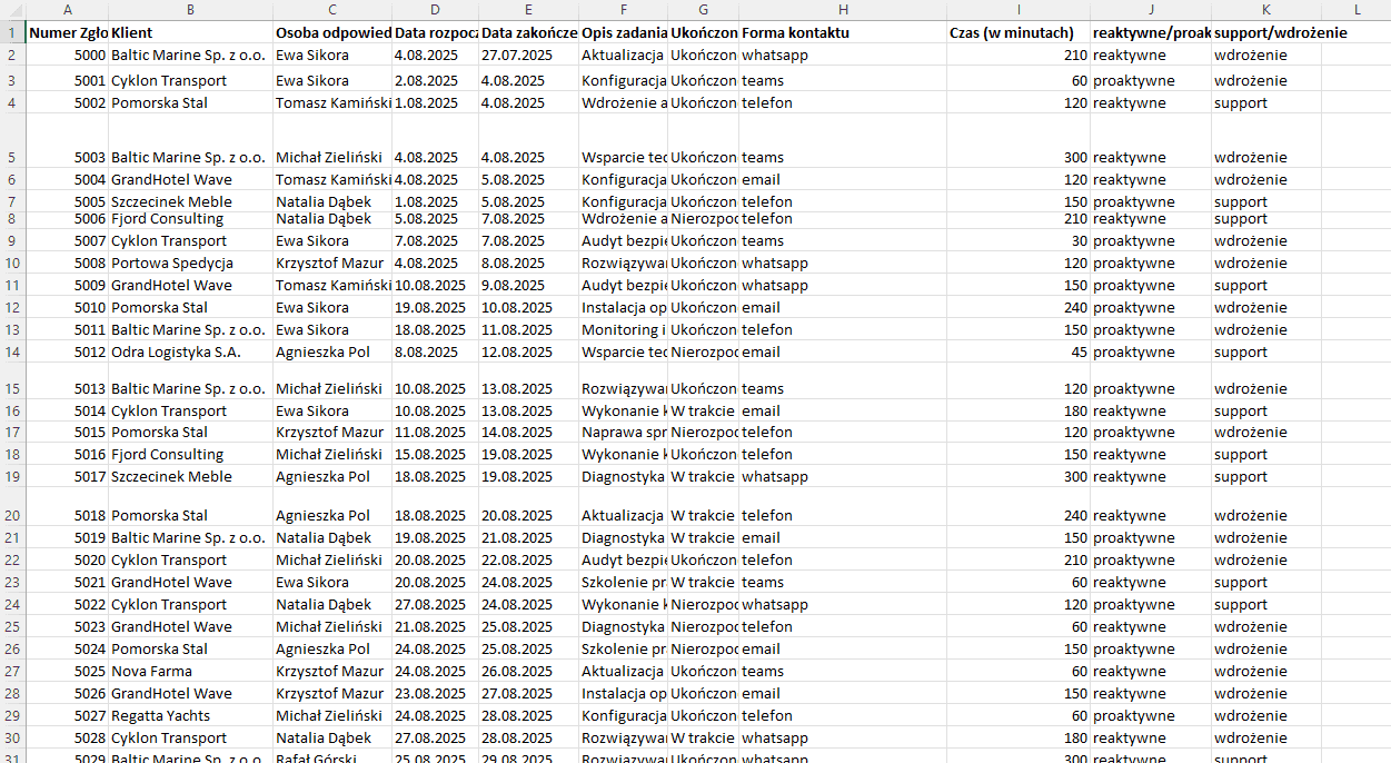 Before
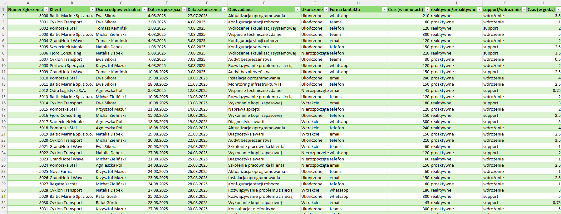 After
AfterCleaning up the raw data — I collected mock ticket and client-hours data (a Security Masters exercise, fictional data) and turned it into a clean Excel table - standardized columns, added calculations, ready to analyze instead of misaligned rows.
Building the model and visuals — I built a dashboard with views ranging from a company-wide overview, through client and subscription level, down to a single responsible person - every level of detail is one click away.
Automatic overage flags — I added conditional rules that immediately highlight clients approaching or past their limit.
Result: one clear view instead of digging through spreadsheets - overages and trends are visible immediately, no manual counting.
Businesses billing clients in hourly packages lose track of who's actually approaching their limit until it's too late.